
When markets rise to new highs, investors often wonder: Is this time different, or are we entering bubble territory? Evaluating whether the U.S. stock market is overvalued requires more than looking at recent gains. Instead, investors can use time-tested measures to compare current valuations against historical averages. Among the most cited tools are Warren Buffett’s Market Cap-to-GDP indicator, the Shiller CAPE ratio, forward P/E ratios, and traditional valuation metrics like stock market dividend yields.
In this blog, we’ll not only explore these indicators but also compare them to conditions during previous bubbles such as 1929, 2000, and 2007, 2021 that preceded major stock market crashes.
Warren Buffett’s Favorite Indicator: Market Cap-to-GDP
Warren Buffett, often referred to as the “Oracle of Omaha” is widely regarded as one of the most successful investors of all time. Recently retired, he built his reputation on a disciplined value investing approach that emphasised buying quality businesses at reasonable prices.
One of the valuation tools most closely associated with him is the “Buffett Indicator.” This measure compares the total market capitalisation of all publicly traded U.S. equities (Wilshire 5000 index) to the USA’s Gross Domestic Product (GDP).
- Historical baseline: Buffett has suggested that when the ratio sits around 70%–80%, the market is fairly valued.
- Overvaluation signal: A reading above 100% indicates that stocks may be overvalued relative to the size of the economy.
- 1929 Wall Street Crash Peak: 90% (estimated)
- 1999/2000 Dot-com Bubble Peak: 140%
- 2007 Great Financial Crisis Peak: 110%
- 2021 COVID-era Peak: Over 200%
- 2025 AI Boom: Over 200%
In other words, by this metric, the U.S. stock market looks stretched compared to economic output.
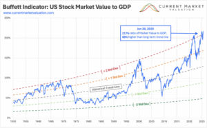
The chart above shows the Buffett Indicator relative to its long-term historical trend. Periods of “Fair Value” cluster around the baseline, while extreme deviations highlight bubbles and crises. At the height of the dot-com boom, the indicator reached about two standard deviations above trend. Today, the ratio is even higher, around 2.2 standard deviations above trend as of mid-2025, signalling valuations well into “strongly overvalued” territory.
Shiller CAPE Ratio (Cyclically Adjusted Price-to-Earnings)
Another widely respected valuation tool is the CAPE ratio, popularised by Nobel laureate Robert Shiller. This ratio looks at the price of the S&P 500 relative to average inflation-adjusted earnings over the past 10 years, smoothing out business cycles.
Historical comparison:
- Historical average: 16–17
- 1929 Wall Street Crash Peak: Approx. 30 (just before the Great Depression)
- 1999/2000 Dot-Com Bubble Peak: Over 44
- 2007 Great Financial Crisis Peak: Over 27
- 2021 COVID-era Peak: Approx. 38
- 2025 AI Boom: Approx. 38
This suggests that while not at Dot-Com extremes, today’s valuations remain significantly higher than long-term averages.
Long-term expectations: Elevated CAPE readings often suggest lower-than-average real returns over the next 10–20 years
Forward Price-to-Earnings Ratios: A Market Premium
Another popular way to gauge valuations is the forward P/E ratio. Unlike the standard P/E, which looks at the past 12 months of earnings, the forward version compares stock prices to expected earnings over the next year. It’s the metric Wall Street analysts often cite because it reflects both price and profit expectations.
Historically, the S&P 500 has traded at a forward P/E of about 15–16. That’s the “fair value” anchor investors use when deciding whether the market looks cheap or expensive.
But history shows the market has often strayed far above this average during periods of exuberance:
- 1929 Wall Street Crash Peak: While earnings data was less standardized then, estimates suggest forward multiples were well above 20. A sign of the speculative mania that preceded the Great Depression.
- 1999/2000 Dot-com Bubble Peak: Forward P/E ratios exploded past 25, as investors priced in unrealistic profit growth from internet companies. When earnings failed to materialize, stocks crashed.
- 2007 Peak Great Financial Crisis: Forward P/E climbed to around 18-19, not nearly as extreme as 2000 but still above the long-term norm. The subsequent financial crisis sent valuations tumbling.
- 2025 AI Boom: Today, the S&P 500 trades on a forward P/E of about 20-22 well above its historical mean, though not at the fever-pitch levels of 2000.
Price-to-Book Ratio: Valuing Assets on the Balance Sheet
The price-to-book (P/B) ratio compares the market value of a company’s equity to its book value, or net assets recorded on the balance sheet. Traditionally, it has been a key metric for value investors because it reflects how much investors are willing to pay for each dollar of assets.
Historical comparison:
- Historical average: Around 2.5–3.0 for the S&P 500.
- 1929 Wall Street Crash: P/B estimates suggest markets were trading well above historical norms, reflecting speculative excess.
- 1999/2000 Dot-Com Bubble Peak: The ratio surged to 5.0+, as investors poured into tech stocks with minimal tangible assets, driving valuations to extremes.
- 2007 Great Financial Crisis: P/B was elevated around 3.5–4.0, as financial stocks in particular traded at lofty multiples of book value before collapsing during the crisis.
- 2021 COVID-era Peak: Ratios climbed again, with the S&P 500 near 4.7, one of the highest readings since the dot-com era.
- 2025 AI Boom: Today, the market trades at roughly 4.5, still well above its long-term norm.
Implications:
Historically, elevated P/B ratios signal investor willingness to pay a substantial premium for growth and intangible assets. While this may reflect structural changes in the economy — such as the dominance of technology and service firms where intangible assets (software, intellectual property, brand value) are less visible on balance sheets. It also highlights the risk of overpaying for expectations rather than tangible fundamentals.
Dividend Yields: A Shrinking Cushion
Dividend yield is one of the oldest measures of stock market value. It simply looks at the annual dividends companies pay out relative to their stock price. For much of the 20th century, the S&P 500 offered investors a steady yield in the 3-4% range, providing both income and a buffer against volatility.
But as stock prices have climbed faster than dividend payouts, that cushion has steadily eroded.
- Historical norm (20th century): Investors could count on yields of 3-4%, making stocks attractive not only for growth but also for income.
- 1929 Wall Street Crash Peak: Dividend yields had dipped below 3% before the market collapsed, highlighting stretched valuations.
- 1999/2000 Dot-com Bubble Peak: Yields fell under 1.2%, the lowest on record at the time, as investors chased growth stocks with little regard for dividends.
- 2007 Great Financial Crisis Peak: Yields again dropped towards 1.8%, another warning sign before the Financial Crisis.
- 2025 AI Boom: The S&P 500’s dividend yield sits around 1.5%, as investors chase the Magnificent 7 and other growth stocks. This value is close to historic lows and far beneath its long-term average.
Why Dividend Yields Matter (and Why They’ve Changed)
A lower dividend yield is essentially the mirror image of a higher valuation – investors are paying more for each dollar of income. Historically, when yields are this low, future returns tend to be weaker.
However, the story today isn’t quite the same as in the past. Quantitative easing (QE) and years of ultra-low interest rates have structurally compressed yields across asset classes. With bond yields suppressed, equities have looked relatively more attractive, and companies have increasingly favored share buybacks over dividends as the preferred way to return capital to shareholders.
So while dividend yields are still a useful historical valuation yardstick, the context has changed. Ultra-low yields don’t automatically mean stocks are destined to underperform. They may simply reflect a world where central bank policies and corporate capital allocation have shifted the playing field.
The Big Picture
Historically, periods of extreme overvaluation: 1929, 2000, 2007 were followed by sharp corrections. By nearly every traditional metric, current valuations suggest the U.S. equity market is once again in expensive territory.
That said, valuations are only part of the story. Factors such as lower interest rates, inflation, monetary policy, and disruptive forces like AI may alter the equation and help sustain higher multiples for longer than history would suggest.
While history shows that extreme valuations often precede sharp corrections, markets don’t always follow a straight path downward. Expensive can get even more expensive, and as the late-1990s dot-com era demonstrated, stretched valuations did not prevent several more years of strong gains before the eventual crash. In other words, while a correction is inevitable at some point, investors should not assume it is imminent, the market may well rise further before any serious reset occurs.
As Keynes warned, “Markets can stay irrational longer than you can remain liquid.”